Thank you for purchasing our plugin.
If you have any questions that are beyond the scope of this help file, please leave a message at the plugin's comment section at codecanyon.
Don't forget to rate the plugin if you like it.
Thank you so much!
Overview
WordPress Tooltips Ultimate Plugin let's you add easily tooltips on your WordPress site. It has tons of features that gives absolute control of your tooltips.
Minimum requirements
- PHP 5.5.0
- WordPress
- JavaScript / jQuery
Features
- Tooltip styling options. Style the tooltip the way you want! Choose background color, borders, margin, padding options.
- Tooltip arrow options. Style the tooltip's arrow easily. Choose width and height, or even hide it.
- Tooltip anchor options. You can even style the tooltip's anchor. Set the anchor cursor selecting between a number of cursors. Or change it's font, background color or padding.
- Interaction options. Show and hide the tooltip the way you want. You have 2 showing options (on hover or on click) and 3 hiding options (on hover out, on clicking anchor or on clicking elsewhere).
- Animation options. Multiple showing and hiding animations. Set the animation type, the time and even a delay if exists.
- Google fonts. Select from a large library of Google fonts and set the desired typography.
- Multiple tooltip position options. top left, top center, top right, center left, center center, center right, bottom left, bottom center, bottom right
- Multiple arrow position options. top left, top center, top right, center left, center center, center right, bottom left, bottom center, bottom right
- Ready-to-use themes. Choose between 22 ready-to-use themes and make cool tooltips on the fly!
- Image tooltips.
- Image & text tooltips.
- Modal tooltips.
- Video tooltips. Add videos from YouTube or Vimeo to show inside your tooltip window.
- Google map tooltips. Add google maps to show inside your tooltip window.
- HTML tooltips.
- Unique styles. 3 unique styles, comic 1, comic 2 & sharp.
- Frontend post content tooltips. Add tooltips to your post content easily throught the WordPress TinyMCE editor.
- Frontend out-of-post tooltips. By using our Live Tooltip feature, you can add tooltips everywhere: menu, widgets, footer, icons, you name it!
- Backend tooltips. You can also add tooltips to the WordPress backend.
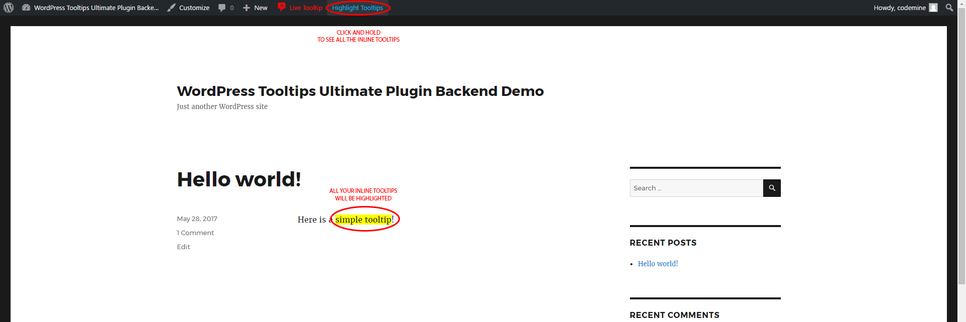
- Highlight tooltips. Want to see what tooltips a page has? You can highlight the active tooltips of the current page easily by clicking a button.
What Can You Do With Tooltips?
Tooltips can still make for a really nice addition to websites for a number of reasons:
- Make your site more reader-friendly. As always, the less text you put on the main interface of your site, the better. If you can tuck away a tip that visitors may not want or need, you can keep your site free and clear of any potentially intrusive text.
- Guide your visitors to take action. If you’ve ever felt the need to have more control over getting visitors to take action, tooltips can give you an extra layer of guidance without having to add another call-to-action into your site’s design.
- Cut down on unnecessary back-and-forth. While your site’s design should already be intuitive, there may be some spots that trip up visitors. Rather than leave them feeling frustrated, confused, or needing to reach out to you for clarification, tooltips can be a built-in guide to your website.
Installation
There are two primary methods for installing any WordPress plugin.
Install with a zip file
-
From your WordPress dashboard, choose
Plugins > Add New -
Select
Uploadfrom the set of links at the top of the page (the second link) -
From here, browse for the zip file included in your plugin purchase titled wordpress-tooltips-ultimate.zip and click the
Install Nowbutton -
Once installation is complete, click
Activate Pluginto activate it and enable its features.
Install by FTP Manager
If you are have no previous web experience and have no idea what an FTP Manager is, then this option is not for you.
- Access your host through the FTP manager
- Access the plugins directory of your WordPress install
/(WordPress directory)/wp-content/plugins/If WordPress is installed on the root folder the directory is
/wp-content/plugins/ - Find the directory titled wordpress-tooltips-ultimate.zip and upload it and all files within to the directory from the previous step.
- From your WordPress dashboard, choose
Plugins > Installed Plugins - Locate the newly added plugin and click on the
Activatelink to enable its features.
Quick Start Guide
Step 1: Create a tooltip style
To create a tooltip, you must first create a tooltip style. A tooltip style is a collection of settings that define the way the tooltip appears.
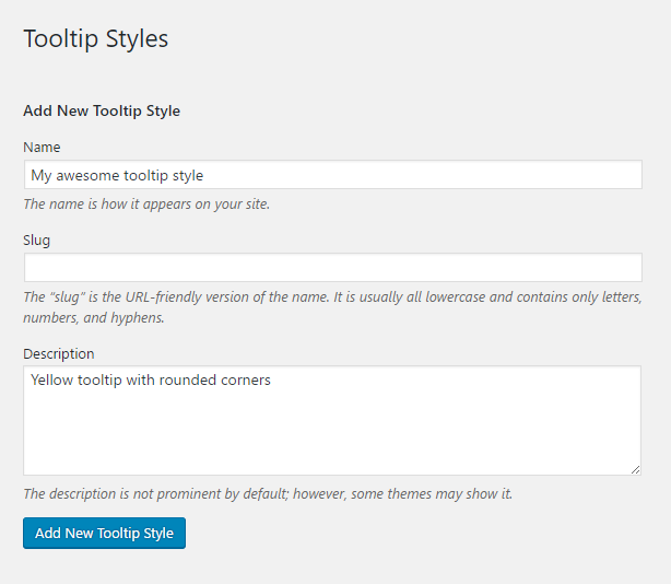
To do so, log in to the WordPress dashboard and go to Tooltips > Tooltips Styles.
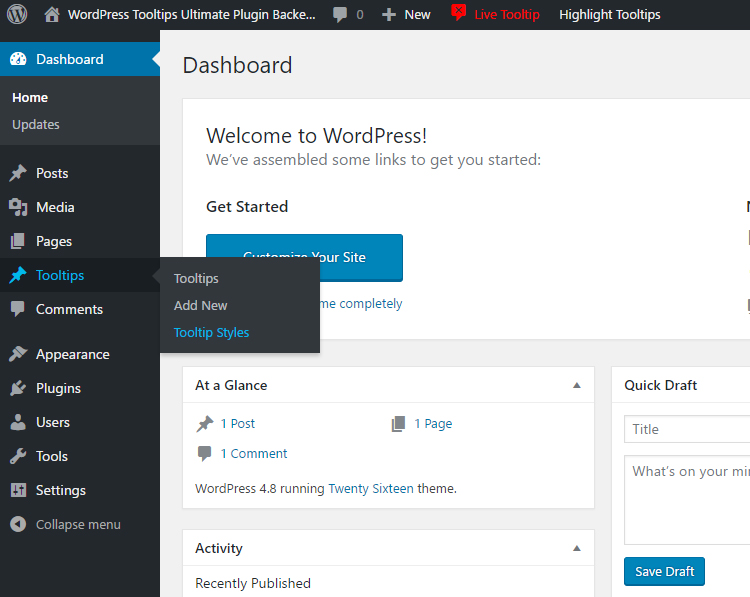
Give a name for your style and press the Add New Tooltip Style button. You can also add a slug for your tooltip, but it's easier to just leave it blank and let wordPress add it automatically. You can optionally add a larger description for your style.
Step 2: Customize your tooltip style
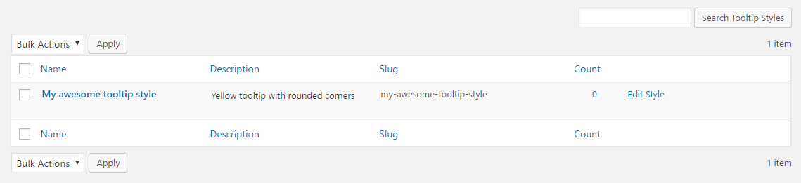
At this time, a new tooltip style will appear at the list of the page. To customize your style, click the Edit Style button on the right column, right next to the style.
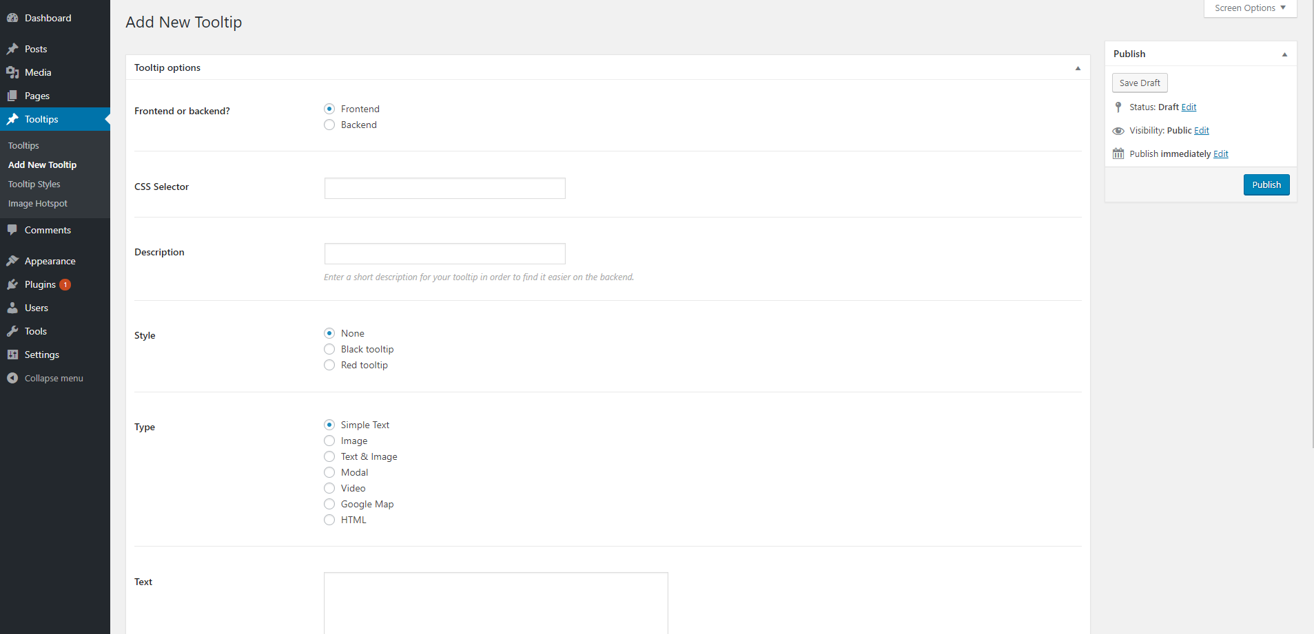
Step 3: Create a tooltip
Now that you have created a tooltip style, it's time to create the actual tooltip. You have 3 available options according to where you want to create your tooltip.
Option 1: Create a tooltip using the WordPress editor
If you want to add a tooltip somewhere inside your page or post content, then this option is ideal.
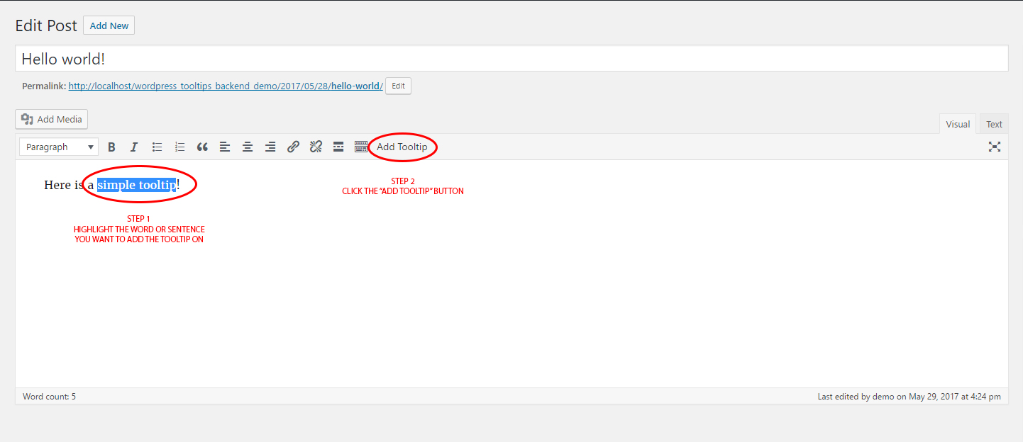
At first, on the WordPress backend, open the desired post or page, highlight the desired word (or words) and click the Add Tooltip button.
Now, fill the available options and click the Save button when you are done.
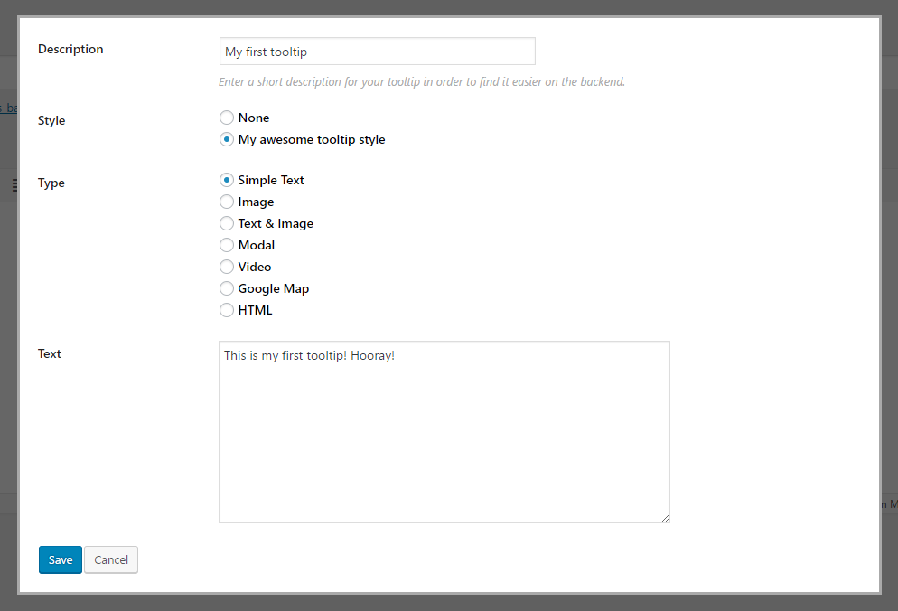
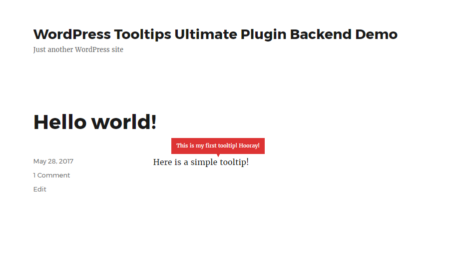
That's it! You have just created your first inline tooltip!
At any time, you can click and hold the Hightlight Tooltips button to take a quick look at your active inline tooltips on the current page.
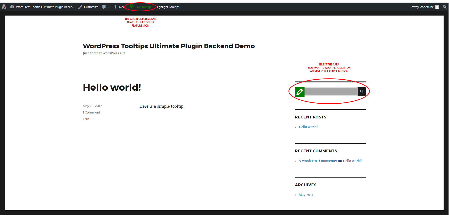
Option 2: Create a tooltip using the Live Tooltip feature
If you want to add a tooltip somewhere else on your page, eg. on menus, widgets, etc., then use this option.
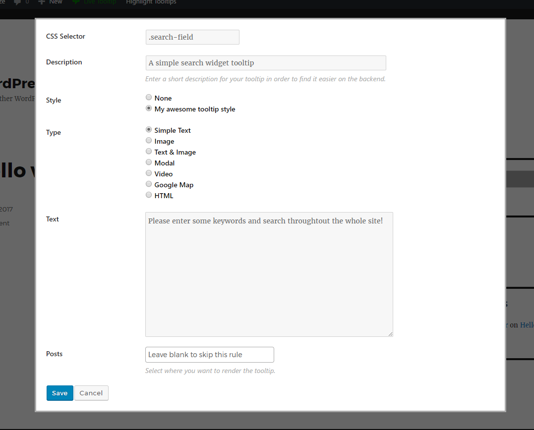
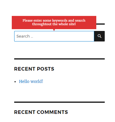
Let's say, for example, that you want to add a tooltip on a search widget. On the frontend of your site, go to the page where you want to add the tooltip. Click the Live Tooltip button on the top administration menu bar.

At this time, the Live Tooltip button will turn to green, indicating that the Live Tooltip functionallity is on. Hover over the area you want to add the tooltip and click the pencil button.
Fill the available options and click the Save button when you are done.
You will notice that the CSS Selector field will be autocompleted with a CSS class, depending on the area you have selected
The CSS selector is autocompleted, just as a help for you to find easily the selector of the tooltip's anchor. In some cases, depending on your site structure and from the area that you want to select, the autocompleted CSS selector may be a very long string. If you know the class or ID of the selected area, you can always, change the autocompleted CSS selector string and replace it with your own. For example, the CSS selector that is genereated, could be #my_id2 > #my_id3 > #my_id4. You could replace this selector with just #my_id4 and you would be fine.
Through the Posts IDs field, you can also select where you want to render this tooltip. Leave it as it is, to render the tooltip to every page of your site. If you want to render it to a specific post or posts, just enter the post IDs in a comma separated way. This is very useful if you have a large number of tooltips and want to optimize your site. There's no use to render tooltips in pages that do not contain them.
That's it! Your tooltip is now ready!
Option 3: Create a tooltip using the your own CSS selector
In some occasions, you may want to add a tooltip to a div by entering your own CSS selector. To do so:
- Go to
Tooltips > Add New Tooltip - In the CSS Selector field, insert the desired CSS selector (eg. .single .desc_content, etc.)
- Fill all the other available options and press Publish to create the tooltip.
Tooltips Styles
A tooltip style is a collection of settings that define the way the tooltip appears. This means that for each tooltip you create, you must also define to which style it belongs.
You can have as many tooltip styles as you wish. For example, you many need a black tooltip for some tooltips (eg. any tooltip that belongs to a post content, a yellow for some others (eg. for menu items), a red for some others (eg. for widget items) and so on.
To customize a tooltip style according to your needs, go to Tooltips > Tooltips Styles and click the Edit Style button on the right column, right next to the style you want to customize.
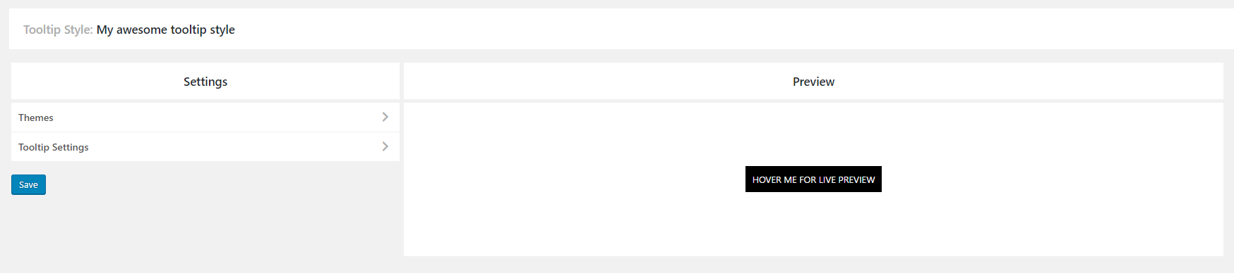
Tooltips Style Settings
You are now at the settings page of the selected style.
This page consists of 3 sections:
- Themes
- Tooltips Settings
- Preview
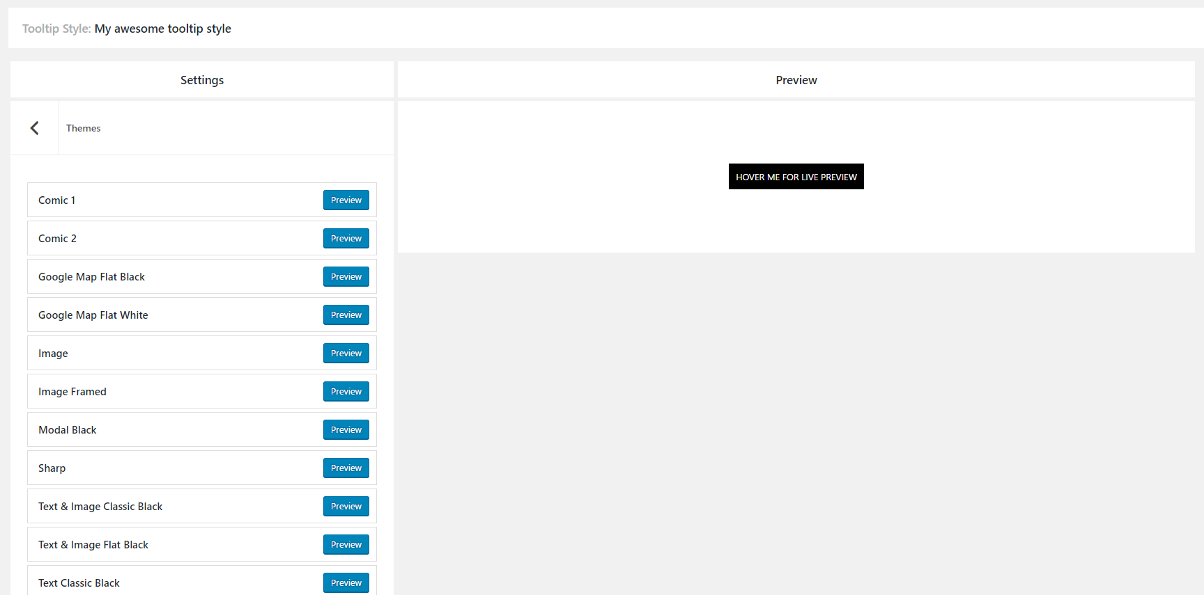
Section 1: Themes
When you first create a tooltip style, you can choose between 22 ready-to-use themes.
To do so, click the Themes button and click the Preview button right next to the desired theme.
You can use the theme as it is or even make modifications to it. Click the Save button to save the tooltip style.
To see the tooltip styling options in action, visit our demo page.
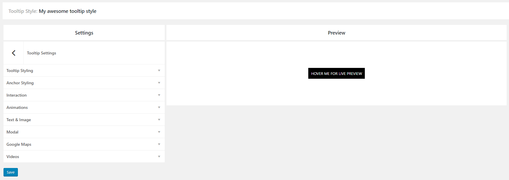
Section 2: Tooltip Settings
To change any of the style settings, click the Tooltip Settings button.
A new menu will appear that consists of the following subsections:
- Tooltip Styling
- Anchor Styling
- Interaction
- Animations
- Text & Image
- Modal
- Google Maps
- Videos
Section 2.1: Tooltip Styling
This section contains every option that has to do with the styling of the tooltip.
To see the tooltip styling options in action, visit our demo page.
- Style Choose between 4 predefined special styles: default, sharp, comic 1 and comic 2
- Max Width The maximum tooltip width in pixels. This defines where break lines appear for long sentences. Default value is 280px.
- Width A standard fixed width for the tooltip. For example, you may use it to set all tooltips with small sentences (or words) to have the same width.
- Tooltip Background Set the background color of the tooltip using a color picker. The same color is applied to tootlip's arrow, if it is enabled.
- Tooltip Background Opacity Set the background opacity of the tooltip. Give a number between 0 and 1, eg. 0.6.
- Tooltip FontSet the tooltip font. The available font options are Font Family, Font Variants, Text Align, Text Transform, Font Size, Line Height and Color.
- Tooltip PaddingSet the tooltip padding in pixels.
- Tooltip BordersSet the tooltip borders.
- Tooltip Drop ShadowShow a drop shadow on tooltip.
- Tooltip PositionAvailable options are top left, top center, top right, center left, center center, center right, bottom left, bottom center, bottom right.
- ArrowEnable or disable an arrow for the tooltip.
- Arrow PositionAvailable options are top left, top center, top right, center left, center center, center right, bottom left, bottom center, bottom right.
- - Arrow WidthThe width of the tooltip arrow in pixels. This option will appear only if you enable the tooltip arrow. Default value is 6px.
- - Arrow HeightThe height of the tooltip arrow in pixels. This option will appear only if you enable the tooltip arrow. Default value is 6px.
- Close ButtonEnable or disable a close button for the tooltip.
- - Close Button BackgroundSet the close button background color using a color picker. This option will appear only if you enable the tooltip close button.
- - Close Button ColorSet the close button icon color using a color picker. This option will appear only if you enable the tooltip close button.
Section 2.2: Anchor Styling
This section contains every option that has to do with the styling of the tooltip's anchor. The tooltip's anchor, is the target of the tooltip. This could be a word, a sentence or even a div element in your site. The apperance of the tooltip depends on your interaction on the anchor (eg. when you hover or click on it).
To see the anchor styling options in action, visit our demo page.
- Anchor cursor Choose between 6 predefined cursors: default, pointer, crosshair, help, cell, zoom in
- Anchor fontSet the anchor font. The available font options are Font Family, Font Variants, Text Align, Text Transform, Font Size, Line Height and Color.
- Anchor BackgroundSet the background color of the anchor using a color picker. You can even set it as trasparent.
- Anchor paddingSet the anchor padding in pixels.
Section 2.3: Interaction
This section contains every option that has to do with the tooltip's interactions.
To see the interaction options in action, visit our demo page.
- Show onDetermines whether the tooltip will be shown on hover or on click.
- Show Delay (in ms)Time in milliseconds by which to delay showing of the tooltip.
- Hide onDetermines whether the tooltip will be hidden on hovering out, on clicking on anchor or on clicking elsewhere.
- Hide Delay (in ms)Time in milliseconds by which to delay hiding of the tooltip.
- Hide When Inactive Time (in ms) Time in milliseconds in which the tooltip should be hidden if it remains inactive e.g. isn't interacted with.
- Hide Other Tooltips When Showing Determines whether or not the tooltip will hide all others when triggered.
- Stay visible when mousing on tooltipWhen enabled, the tooltip will not hide if moused over, allowing the contents to be clicked and interacted with. Adding a hide delay is generally done when this is enabled to give the user time to mouseover the tooltip before hiding.
- TargetThe element the tooltip will be positioned in relation to. Can be set to event or mouse.
- - Follow Mouse Determine whether the tooltip follows the mouse when hovering over the target. This option will appear only if you set the target to mouse.
Section 2.4: Animations
This section contains every option that has to do with the tooltip's animations.
To see the animation options in action, visit our demo page.
- Show Animation Choose between 10 predefined animations when you show the tooltip: fade, fade down, fade left, fade right, fade up, zoom, flip X, flip X up, flip Y, flip Y up.
- Show Animation Time (in ms)The showing animation time of the tooltip in milliseconds.
- Hide AnimationChoose between 6 predefined animations when you show the tooltip: reverse initial animation, fade, fade down, fade left, fade right, fade up.
- Hide Animation Time (in ms)The hiding animation time of the tooltip in milliseconds.
Section 2.5: Text & Image
This section contains extra options that belong to the Text & Image Type tooltip. You will only need it if this style refers to a tooltip that has a text and image at the same time.
To see the text & image tooltip type options in action, visit our demo page.
- Text PaddingSet the padding of the text inside the tooltip in pixels.
Section 2.6: Modal
This section contains extra options that belong to the Modal Type tooltip. You will only need it if this style refers to a modal tooltip.
To see the modal tooltip options in action, visit our demo page.
- Overlay BackgroundSet the background color of the modal's overlay using a color picker. You can even set it as trasparent.
Section 2.7: Google Maps
This section contains extra options that belong to the Google Map tooltip. You will only need it if this style refers to a tooltip that shows a Google Map.
To see the google map tooltip options in action, visit our demo page.
- Google mapsEnable this option if you want to use google map tooltips.
- - API KeyPaste your API key here in order to use google map tooltips. You may obtain your key here.
- - HeightThe google map height in pixels. Default value is 200px.
- - Pin ImageThe url of the pin's image. Upload first the desired pin at your WordPress media library and the paste the image's url here.
- - ZoomThe map's zoom level. Default value is 10.
- - Snazzy Maps CodeEasily add snazzy map styles to your google map tooltip. To do so, just go to the snazzy maps site, select the desired style, copy the json and paste it in our options panel. That's it!
Section 2.8: Videos
This section contains extra options that belong to the Video tooltip. You will only need it if this style refers to a tooltip that shows a video.
To see the video tooltip options in action, visit our demo page.
- VideosEnable this option if you want to use video tooltips.
- - HeightThe video height in pixels. Default value is 200px.
- - Auto PlayEnable or disable auto-play for the video, when triggering the anchor.
Section 2.9: HTML
This section contains extra options that belong to the HTML tooltip. You will need it if you insert links in your HTML tooltip.
- Link FontSet the link font. The available font options are Font Family, Font Variants, Text Align, Text Transform, Font Size, Line Height and Color.
- Link hover colorThe color of the link, when you hover on it.
Section 3: Preview
In the preview area, you can see instantly a demo tooltip depending on the current settings.
Just make a change in the style settings and you can see on-the-fly the applied changes. If you are happy with them, click the save button to save your style.
Tooltip Types
When you create a tooltip, you can choose between 7 different tooltip types:
- Simple Text
- Image
- Text & Image
- Modal
- Video
- Google Map
- HTML
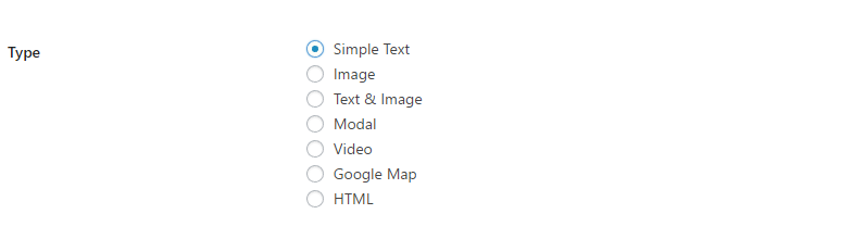
The tooltip type defines the content that you can add in each tooltip. For example, if you want to create a text tooltip, just select the simple text type , for video tooltips, select the video type, and so on.
Each tooltip type has its own settings according to the type's needs. For example, a simple text type, has only a textarea field, a video type has only a video url field, and so on.
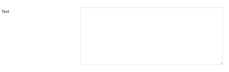
Simple Text
The most common tooltip type. It only contains a text.
Image
Contains only an image.

To see some image tooltip examples in action, visit our demo page.
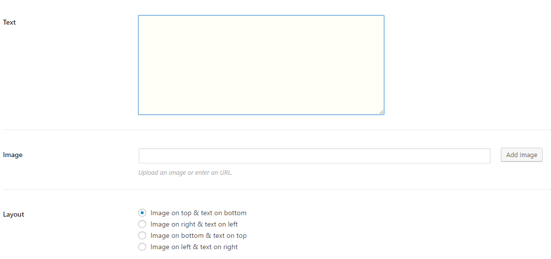
Text & Image
Contains an image and a text at the same time.
It includes 3 option fields:
- Text
- Image
- 4 different layouts
To see some text & image tooltip examples in action, visit our demo page.
Modal
The modal tooltip type allows you to create tooltips which 'dim' the rest of the page when shown, drawing users attention.
To see some modal tooltip examples in action, visit our demo page.
Video
Contains a YouTube or Vimeo video. Just copy the url of the video, paste it in the Video URL field and you are set!

To see some video tooltip examples in action, visit our demo page.
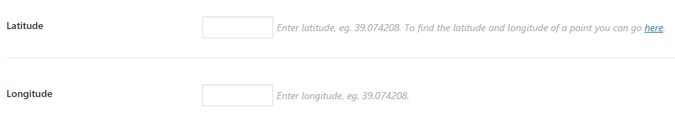
Google Map
Contains a google map.
It includes 2 option fields:
- Latitude
- Longitude
To find the latitude and longitude of a point you can go here.
To see some google map tooltip examples in action, visit our demo page.
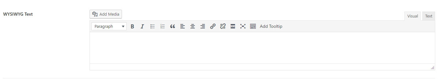
HTML
Contains a WYSIWYG editor in which you can add formatted text (with links, em tags, etc.) or in some cases, even shortcodes.
To see some HTML tooltip examples in action, visit our demo page.
Image hotspot
Except for tooltips on texts or divs, you can also add hotspots inside an image that trigger the tooltips.
Creating your image hotspots
- Log in to the WordPress dashboard and go to
Tooltips > Image Hotspot. - Click the
Add Newbutton. - In the first field, give a title for your image hotspot. This is only for administration purposes.
- In the image field, set an image on which you want to add your hotspots.
- Now you can customize your hotspot by using the other settings at the global settings.
- Having set up the design of the hotspot, you will now see it at the top left corner of your image. Drag and drop it to the desired point.
- If you want to add more hotspots, just click the
Add another hotspot tooltipbutton. - When you are ready, press the
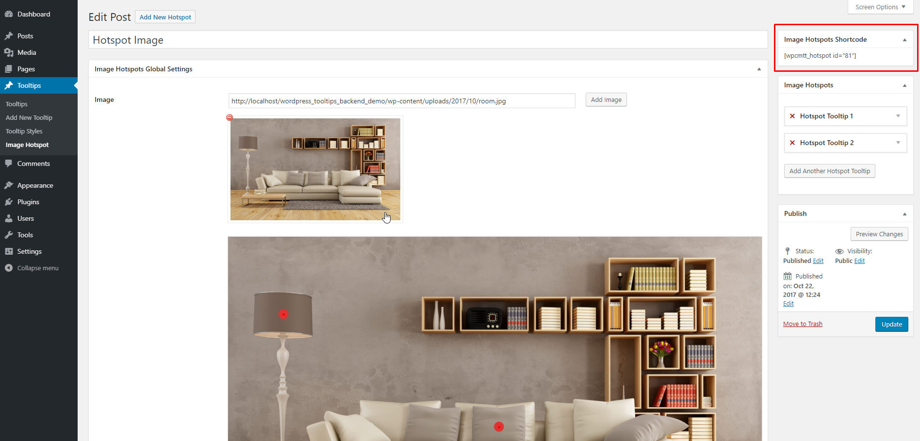
Publishbutton. - Copy the shortcode and place it at your site (eg. in a post content, a page content, a Visual Composer, etc.)
Image Hotspots Global Settings
Here is a full list of the hotspot image settings. The settings below are global, which means that every hotspot that you will create on your image will inherit these options. If you want, you can customize each hotspot on your image separately. This may come in handy, if you want, for example, to use a different image or icon for some of your hotspots.
- ImageThe image you want to add the hotspots on.
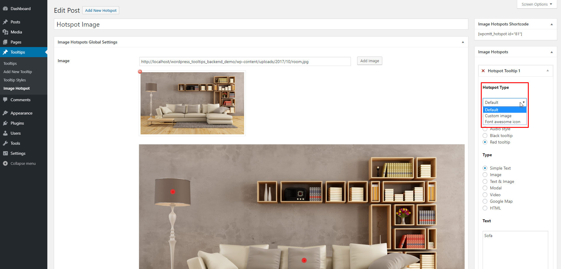
- Hotspot TypeChoose between a custom image or a font awesome icon for your hotspots.
- Hotspot ImageHere you can set the custom image for your hotspot. This option will appear only if you have chosen the custom image hotspot type.
- Image WidthHere you can set the width for your hotspot image. Leave it empty to use the original image size. This option will appear only if you have chosen the custom image hotspot type.
- Image Width SmartphonesThis option will appear only if you have chosen the custom image hotspot type.
- Image Width Tablets PortraitThis option will appear only if you have chosen the custom image hotspot type.
- Image Width Tablets LandscapeThis option will appear only if you have chosen the custom image hotspot type.
- IconSelect between 503 font awesome icons for your hotspots. This option will appear only if you have chosen the font awesome icon hotspot type.
- Icon ColorSelect a color for your hotspot icons. This option will appear only if you have chosen the font awesome icon hotspot type.
- Icon SizeSelect a size for your hotspot icons. This option will appear only if you have chosen the font awesome icon hotspot type.
- Icon Size SmartphonesThis option will appear only if you have chosen the font awesome icon hotspot type.
- Icon Size Tablets PortraitThis option will appear only if you have chosen the font awesome icon hotspot type.
- Icon Size Tablets LandscapeThis option will appear only if you have chosen the font awesome icon hotspot type.
- Hotspot Pin PositionChoose between 9 predefined pin positions (top left, top center, top right, center left, center center, center right, bottom left, bottom center, bottom right). You can even select the custom position, if you want to fine tune and position your hotspot pin point anywhere on your image or icon.
- Hotspot Pin AnimationChoose between 2 cool animations for your hotspots: pulse and fade.
- Horizontal Hotspot Pin Position (%)This option will appear only if you have chosen the custom hotspot pin position.
- Vertical Hotspot Pin Position (%)This option will appear only if you have chosen the custom hotspot pin position.
Image Hotspots
This is the section with which you can add the hotspots at your image. You can add as many hotspots as you like.
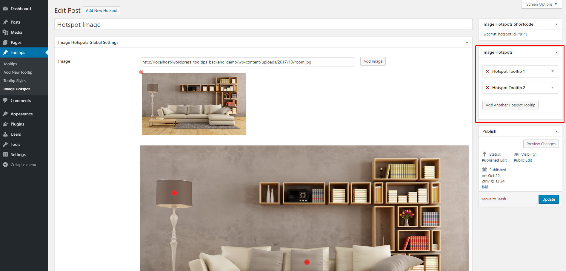
- Hotspot TypeIf you want to set a different hotspot for the selected hotspot, here is the place to do it.
- StyleSelect the tooltip style for the hotspot.
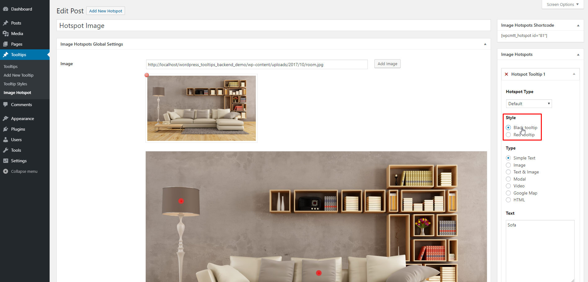
- TypeSelect the tooltip type for the hotspot.

Image Hotspots Shortcode
Here you can find the shortcode for the image hotspots. Just copy the shortcode and place it at your site (eg. in a post content, a page content, a Visual Composer, etc.)
Changelog
24.08.2021 version 2.31
- Fix - PHP version 8 fix
29.04.2021 version 2.30
- Fix - Fix modal clickable links
03.01.2021 version 2.29
- Fix - Wordpress 5.6 hotspot draggable fix
09.06.2020 version 2.28
- Fix - Update vimeo code / remove froogaloop / add player.js
20.11.2019 version 2.27
- Add - Option for RTL (Right-to-left) mode
08.11.2019 version 2.26
- Add - wpcmtt_initial_content_inlinecss filter
26.09.2019 version 2.25
- Fix - PHP warnings in backend
23.09.2019 version 2.24
- Fix - Viewport smart positioning to keep tooltips within the viewport
31.07.2019 version 2.23
- Fix - Tweenmax optimization for multiple tooltips on the same page
- Fix - Set Tooltip hide delay to 90ms for all themes
27.06.2019 version 2.22
- Add - Tooltip close button size
- Add - Tooltip close button padding
12.03.2019 version 2.21
- Fix - Remove mixed content error
11.02.2019 version 2.20
- Add - Make hotspot icons compatible with Font Awesome 4.7.0
07.02.2019 version 2.19
- Fix - Give the ability to add url links inside text/image tooltip type
14.12.2018 version 2.18
- Add - Responsive max width option for smartphones/tablets portrait/tablets landscape
- Add - Custom CSS code option
24.10.2018 version 2.17
- Fix - Gutenberg compatibility
26.09.2018 version 2.16
- Fix - PHP version 7.2 error
06.09.2018 version 2.15
- Add - Select post IDs option for live tooltips to be rendered
- Add - check_if_render_live_tooltip filter for live tooltips to be rendered
28.08.2018 version 2.14
- Fix - Compatibility with other plugins that use CMB2 plugin
11.05.2018 version 2.13
- Add - Notification message if user has no styles created
07.05.2018 version 2.12
- Add - Tooltip max height option
29.04.2018 version 2.11
- Add - Show on page load interaction
06.03.2018 version 2.10
- Add - New filter wpcmtt_render_posts_select2_field for performance optimization
06.03.2018 version 2.9
- Add - New filter for isotope incompatibility
19.01.2018 version 2.8
- Add - New filter with which you can force hotspot type default for all hotspots
- Add - New filter with which you can force text type for all hotspots
- Add - Modal type compatible with shortcodes
- Fix - Hotspot modal bug
- Add - Show on focus interaction
- Add - Show on click or focus interaction
- Add - Hide on focus out interaction
21.12.2017 version 2.7
- Fix - Polylang fix
- Fix - HTML tooltip type new line breaks fix
- Fix - WP Bakery Builder tinymce fix
10.12.2017 version 2.6
- Fix - Frontend performance optimizations
05.12.2017 version 2.5
- Language - Plugin localization
- Add - Patch with which you can import all themes at once
- Fix - Warning errors on debug true
- Fix - Include vimeo's froogaloop API js in plugin
30.11.2017 version 2.4
- Fix - Live tooltip optimization
17.11.2017 version 2.3
- Fix - Tweenmax update
14.11.2017 version 2.2
- Add - Left Column Size (in percentage) for text-and-image type
- Add - Image horizontal position for text-and-image type
- Add - Image vertical position for text-and-image type
- Add - Image padding for text-and-image type
- Add - Backend preview mode for all types: image, text and image (4 layouts), modal, video & map
- Fix - Backend errors with tooltip icon on editor
- Fix - Search custom fields fix
20.10.2017 version 2.1
- Fix - Backend errors with debug true
- Fix - Add line breaks on tooltip for text and html type when user leaves line breaks
18.10.2017 version 2.0
- Add - Image hotspot feature
02.10.2017 version 1.2
- Add - Tooltip background opacity
- Add - Tooltip content link font
- Add - Tooltip content link hover color
21.09.2017 version 1.1
- Fix - Visual Composer Compatibility issue
04.09.2017 version 1.0
- Initial release